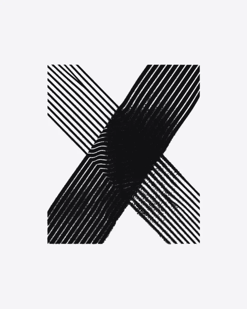
Every design in this shop follows the same rule. Start with something plain: a grid of straight rules, a stack of parallel bars, a field of evenly spaced dots. Then apply one distortion to the whole thing and stop.
That is the entire method. It sounds like a limitation, and it is, deliberately.
What one actually means
One distortion means one operation applied to the whole image. Bend the grid. Shear the bars. Rotate each band a little further than the one above it. It happens once, uniformly, and nothing gets added afterwards. No texture layer, no second warp on top to make it look busier, no drop shadow to fake depth.
The moment a second effect goes on, the eye stops being able to reconstruct what the original was. And reconstructing the original is the whole pleasure of an optical print. You see a shape, your brain works out what it used to be, and the distance between those two things is the design.
Moire is the clearest case. It is two identical line grids laid over each other a few degrees apart. That is all of it. One rotation. The interference pattern you see is not in the file at all, your eye makes it, and adding a gradient or a second overlay would kill it outright.
Restraint reads as deliberate
There is a practical reason too. A print with one thing going on stays legible at ten metres. Someone across a room reads a soft arc, or a wave, or a bulge, and takes it as a shape. Walk closer and it resolves back into forty separate straight lines. Two different images out of the same print, depending on where you stand.
A print with five things going on gives you nothing at ten metres and a mess at arm’s length. It fails at both distances at once. Plenty of graphic tees fail this way, and usually not because the artwork is bad. There is just too much of it competing for the same square of fabric.
The rule came out of the name
Warp is not decoration in the brand name, it is the instruction. Something straight goes in, something bent comes out, and you can still see the straight thing underneath. If the original were unrecoverable, the word would not apply.
That is also why the whole visual system starts from the mark: seven straight lines put through exactly one sine period. It is the smallest possible demonstration of the rule, and everything else in the drop is a larger version of the same idea.
Where the rule gets difficult
The honest part: it is easy on paper and awkward in practice. One distortion applied to a plain system usually produces something boring. Most attempts do. The work is not in adding more, it is in picking which system and which distortion, and then in getting the amount right.
Too little and it reads as a printing fault. Drift sits on that line on purpose: its rows slip out of alignment gradually, so at the top of the shirt the offset is small enough to look like a mistake, and by the bottom it is obviously intentional. That tension is the design, and it took more passes than any of the symmetrical ones.
Too much and the original system disappears, which breaks the rule from the other direction. There is a narrow band in the middle where it works, and finding it is the job.
It is not a phase
Field Drop 01 is built entirely on this constraint, and whatever comes after it will be built on the same one. New systems, new distortions, same rule.
If something ever ships here with two effects stacked on it, assume a mistake. The drop is here if you want to check the designs against the rule.